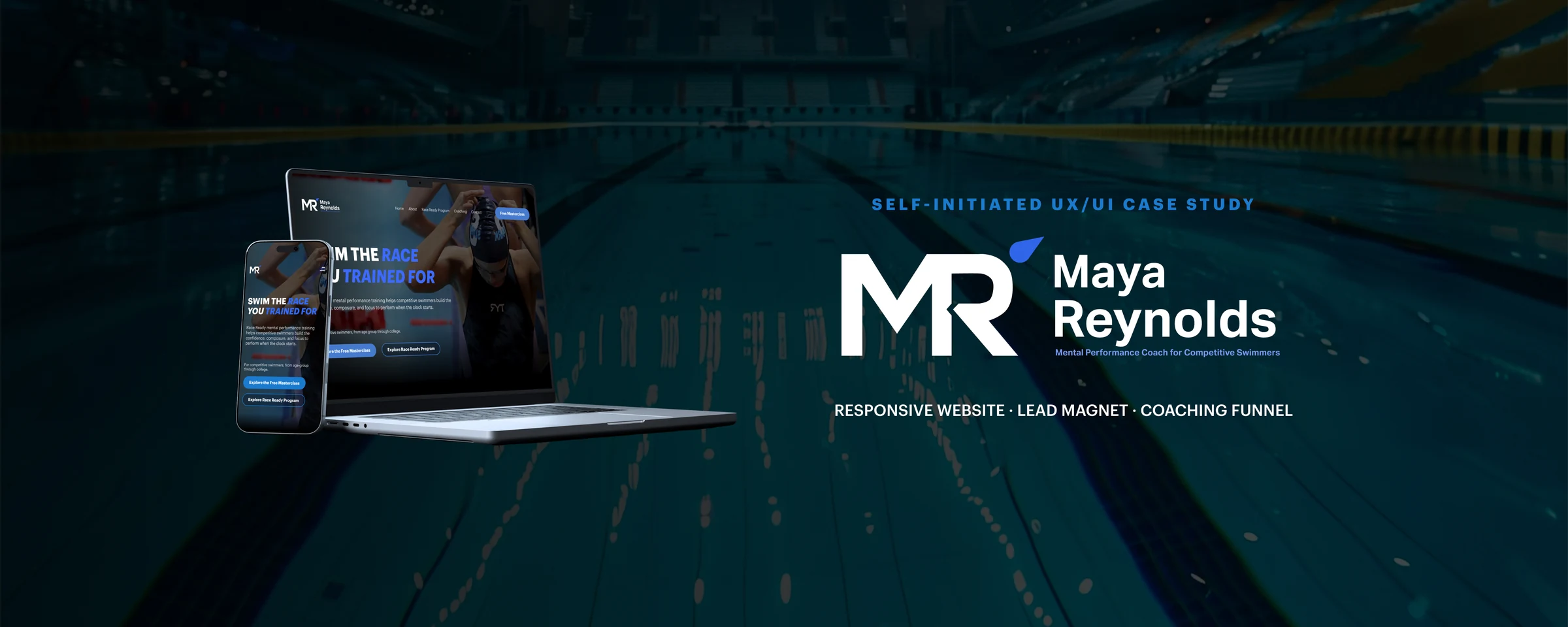
A decision-led service ecosystem for a fictional mental-performance coach in competitive swimming.
| PROJECT DETAILS | |
| Role | End-to-end UI/UX & Visual Designer |
| Scope | Strategy · Information architecture · User flows · Visual identity · Responsive UI · Prototype · Developer handoff |
| Deliverables | 13 desktop layouts · complete conversion states · 6 mobile concept screens |
| Tools | Figma, FigJam |
| Platform | Desktop-first responsive services website |
| Year | 2026 |
A clear path from pre-race pressure to the right kind of support
An end-to-end website concept for a fictional mental-performance coach in competitive swimming. I structured five offers into one decision-led ecosystem for swimmers, parents and teams—from first education to booking, application and confirmation.
View the Figma project ↗ · Explore the user flow in FigJam ↗
Case navigation
Problem, audience and constraints
Mental-performance support is difficult to make tangible online. The website had to explain Maya’s method, organise five offers into a coherent system and help three audience groups recognise the right next step. A swimmer may need immediate help before a qualifying race; a parent wants to support their child without adding pressure; a coach or club is evaluating support for an entire team. Because this is a self-initiated concept, the structure is based on stated design assumptions rather than client analytics or live user data.
The design challenge
- Make abstract expertise concrete through recognisable situations and clear next steps.
- Separate five offers without building a catalogue or making price the main decision.
- Serve swimmers, parents and teams inside one coherent experience.
- Design beyond the marketing pages, including forms, confirmations, external transitions and edge states.
Who the experience serves
- Competitive swimmers need to recognise their performance challenge and find an appropriate level of support.
- Parents and guardians need a way to help without adding pressure or taking control of the athlete’s preparation.
- Coaches, clubs and organisations need to evaluate workshops, presentations and team support efficiently.
Across all three paths, the goal is the same: understand the method, compare the available formats and choose a next step without unnecessary pressure.
Three decisions that shaped the experience
01 / Decision hub
Home guides rather than lists. The page helps visitors recognise their situation before introducing a service.
02 / Support levels
Offers are organised by need, not price. Visitors choose between learning, focused help and longer-term support.
03 / Complete journeys
Every action has a clear ending. Forms, confirmations and external transitions are designed as part of the experience.
Information architecture and user flows
Before designing any screen, I mapped the site in FigJam: the sitemap, the primary conversion paths, and the states around them—learning about the method, comparing options, applying or making contact, moving to an external service, and receiving confirmation. The result is a hub-and-branch structure rather than a single linear page. Home works as the decision-making hub; each service has a page deep enough to evaluate it; and the funnels—masterclass, purchase, booking, application—run as short independent paths that always end in an explicit confirmation. The journey follows four steps: Recognise the problem → understand Maya’s method → identify the right level of support → take the next step This step expanded the project from a set of marketing screens into a connected website experience.
The flow maps the decision paths, service pages, forms, external platforms and confirmation states before UI design begins.The service ecosystem
The five offers are organised by level of support rather than by price, so the visitor can choose by situation instead of by budget.
| Path | Offer | Best suited to |
| Learn | Race-Ready Mind Masterclass | A low-pressure introduction to Maya’s approach |
| Focused support | Race Ready Program · Race Strategy Intensive | Independent learning or one immediate performance challenge |
| Ongoing support | Mental Performance Coaching · Team Workshops & Speaking | Longer goals, a competitive season or an entire team |
Visual direction
The visual language combines calm concentration with competitive energy. The system is intentionally controlled so the subject feels focused rather than clinical.
Typography Graphik creates hierarchy through scale and weight, from an uppercase editorial hero to compact captions.
Colour Neutral surfaces and deep navy establish calm; one blue accent is reserved for links, keywords and calls to action.
Layout A consistent 12-column desktop grid and generous vertical spacing give dense content room to breathe.
From pool lanes to a personal mark
The logo started as three parallel lines referring to swimming lanes. They introduced rhythm and forward movement, but the shape stayed abstract and could be read as a V rather than an M. A second direction added a flowing wave to make the water reference immediate, which strengthened the sport connection but felt decorative rather than personal to Maya. The final direction combines the initials M and R into one compact geometric monogram, with a blue drop-shaped accent that suggests water without turning the logo into a literal swimming symbol. The mark ships as a system: primary, monochrome and inverse.
Three iterations show the shift from a literal swimming reference to a compact personal mark.Selected design decisions
1. Home as a decision-making hub
The Home page is structured as a decision sequence rather than a list of offers. It moves from the problem and the audience cue, through the Race Ready method and Maya’s own story, into credibility content, the full offer system, the masterclass entry point, FAQ and a final call to action. Every visitor can stop at the point where they recognise themselves and continue from there.
The complete Home page is embedded below; open it at full size to review the full decision sequence.2. Explain the method before presenting the offer
The opening sections name situations a swimmer already recognises—pre-race nerves, attention lost to competitors and expectations, or one mistake affecting the rest of the race—and only then introduce the Race Ready method. Maya’s story and credibility content appear before any service is proposed. Because the brand is fictional, biographical and testimonial content is illustrative rather than real evidence.
The interface moves from recognisable situations to the method and only then to the offer.3. Offer pages with enough depth to decide
Each service page carries the depth its decision requires. The Program page explains the structure and includes dedicated parent-support content. The Coaching page compares a focused 90-minute Intensive with an 8–12-week coaching experience, helping visitors choose between two levels of involvement rather than two prices.
The comparison makes duration, commitment and purpose easier to evaluate at a glance.4. Forms, confirmations and external transitions as part of the experience
The concept covers the journey beyond the marketing pages: masterclass registration → confirmation → the watch page with its downloadable material; purchase → welcome → transition to the course platform; booking → booking confirmed; coaching application → application received; contact → success modal. Checkout, course access and session booking are delivered by third-party services, and the design names them as such, so the visitor always knows when they are leaving the site. External-link overlays for social platforms and a custom 404 page complete the set of states.
The journey continues beyond conversion: registration, booking, application and contact each end with an explicit confirmation.5. Responsive scope and limitations
Six mobile concept screens cover the highest-value moments—the Home hero and testimonials, Maya’s story, the program overview, the coaching page and masterclass registration. They demonstrate how typography, spacing, content hierarchy, component stacking and image treatment should behave on small screens. They are a direction rather than a complete mobile specification, and the handoff notes say so explicitly.
Design system and handoff
As the number of pages and states grew, I consolidated the interface into a reusable system: global components (navigation, buttons, slider controls, icons), form components (text fields, dropdowns with real content examples, radio buttons and checkboxes), content components (FAQ accordion, the reusable masterclass CTA banner, card sections), interaction states and overlays, and repeating page patterns. The file closes with developer handoff notes: project scale, primary reference layouts, asset locations, expected form behaviour and the parts that still require confirmation before development—final URLs, platform integrations, analytics and legal content.
Reusable components, form states and handoff notes show how the concept can move from presentation into implementation.Validation and next steps
Because this is a self-initiated concept, it has no live conversion data and does not claim measured business impact. The next step would be to validate the decision structure with representatives of the three audience groups.
- Can swimmers, parents and coaches identify the most relevant path without guidance?
- Is the difference between the Intensive and ongoing Coaching clear before price becomes the focus?
- Do visitors understand when a booking, purchase or course-access step moves to an external platform?
- Do the highest-value journeys remain readable, operable and accessible on smaller screens?
Outcome
Clarity Five offers become one hierarchy of support with a low-pressure educational entry point.
Coverage The concept includes service pages, forms, confirmations, overlays and external transitions—not only promotional screens.
Scale A reusable component library, visual system and handoff notes support future content and implementation.
The final concept connects positioning, service architecture, user flows, responsive UI and implementation guidance into one coherent website system. Its outcome is design completeness and decision clarity; business performance would need to be measured after validation and launch.