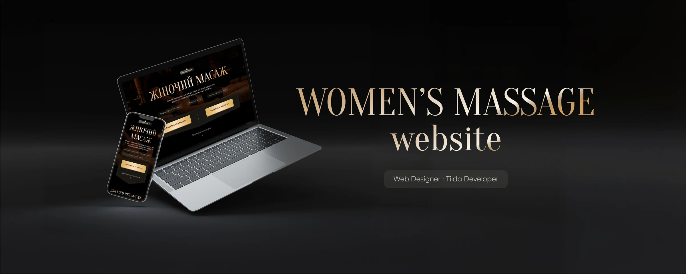
A trust-led promotional website for an independent offline massage practice.
| Project | Women’s Massage Website |
| Role | Web Designer · Tilda Developer |
| Scope | Strategy · Information architecture · UI design · Responsive Tilda build |
| Timeline | Approximately four weeks |
| Tools | Figma, Tilda |
| Platform | Responsive promotional landing page |
A trust-led promotional website for an offline massage practice
I designed and built a responsive landing page for an independent massage practitioner. It presents two massage formats, establishes trust around a sensitive service, and guides visitors to request an offline session through Instagram or Telegram.
Click any image to view it at full size.Context
I proposed the collaboration after seeing a mismatch between the distinctive service and its existing website. The new page needed to work as a promotional landing page for advertising traffic: explain the offer, express its atmosphere and boundaries, and lead visitors towards booking an offline session. The previous page showed only basic information. It did not clearly distinguish the massage formats, introduce the practitioner, or answer important questions about privacy, consent, and the session experience.
The challenge
- Sensitive positioning. Express sensuality without presenting the service as erotic.
- Trust before booking. Explain privacy, consent, boundaries, and the right to stop before asking visitors to choose a service.
- Recognition without a logo. Build a distinctive identity for an independent practitioner through typography, colour, atmosphere, and personal character.
- Limited and changing content. Work with existing video stills, then adapt the service layout when portrait videos became a requirement.
Discovery and information architecture
Before designing the final layout, I explored two structures:
- Two focused pages — one for massage and one for the planned course.
- A practitioner-led website — an introduction to the practitioner followed by his services and separate paths for massage and training.
I recommended the second option as the clearer and more scalable direction. When the client later cancelled the planned course, I narrowed the scope to the massage service and retained a focused booking journey. The page follows a deliberate decision path:
- Recognise — reflect the visitor’s tension, fatigue, and desire to reconnect with the body.
- Understand — explain the experience and distinguish sensual massage from relaxation massage.
- Feel safe — describe the session flow, confidentiality, consent, and personal boundaries.
- Trust — introduce the practitioner and answer sensitive questions openly.
- Book — help the visitor choose a format and submit a massage booking request through Instagram or Telegram.
Process timeline
- Discovery and structure. Confirmed the practitioner’s positioning, explored two possible site structures, and defined the booking journey.
- Visual direction. Compared red and gold concepts, selected the calmer gold direction, and completed the main desktop layout.
- Content adaptation. Worked with the available social-media materials, removed the cancelled course from scope, and expanded the service cards for portrait video.
- Build and handoff. Built and tested the responsive Tilda page, prepared the media sections for client-managed video, and published the project.
Visual exploration
I reviewed premium service, editorial, and cinematic references, focusing on a dark immersive base, elegant serif typography, clear card hierarchy, restrained decoration, and warm metallic accents. The practitioner’s social content added a personal cue: a restrained masculine presence with an old-world, aristocratic character. I used it to avoid a generic spa aesthetic. I tested red and gold accents on the same dark foundation. Red felt dramatic but too intense; gold felt warmer, calmer, and more trustworthy. I carried the selected gold direction through the buttons, borders, pricing, and interface details.
Visual direction
A deep black base and champagne-gold accents create a private, refined atmosphere. Serif typography adds personality, while a restrained sans-serif keeps longer explanations easy to read. Traditional interiors and the hat translate the practitioner’s established public persona into a coherent setting rather than acting as literal massage symbols. With no studio shoot available, I unified video stills and supporting imagery through controlled crops, dark overlays, and consistent colour treatment. The result remains sensual, respectful, and non-explicit.
The solution
1. Set the tone — and the boundaries — immediately
The hero pairs a cinematic visual with a concise value proposition, a visible booking action, and trust markers covering confidentiality, audience, and personal boundaries.
2. Turn emotional interest into service clarity
The page moves from recognisable emotional and physical needs into two clearly differentiated massage formats. When portrait video became a requirement, I replaced two compact comparison cards with larger alternating service blocks, giving each video, description, price, and booking action enough space.
3. Make consent part of the interface
Consent is treated as core content rather than a small disclaimer. The session flow and FAQ address privacy, clothing, recording, shyness, personal boundaries, and the right to pause or stop.
4. Make the path to booking clear
The content sequence moves from understanding the offer to resolving concerns, choosing a massage format, and requesting an offline session through Instagram or Telegram.
5. Design the experience for mobile
I recomposed the mobile layout instead of simply scaling down the desktop version, adjusting content order, typography, portrait-video framing, spacing, and button behaviour.
From design to live website
After approval, I translated the Figma layouts into a responsive Tilda build and prepared the service sections for portrait video. I designed and published the page; custom-domain connection, final video insertion, and Instagram or Telegram links remained with the client. The project moved from initial concept to a published page in approximately four weeks.
Client response
“You captured exactly the atmosphere I wanted. I especially appreciated your initiative: you took material that initially seemed unrelated and integrated it into the concept so carefully that it added an aesthetic quality I had not expected. I am very glad I chose to work with you.”
— Client, independent massage practitioner
Outcome
- Delivered a responsive Tilda landing page with a clear path from service discovery to a booking request.
- Distinguished two massage formats through separate, video-ready service sections.
- Made consent, confidentiality, and personal boundaries part of the main user journey.
- Created a recognisable visual system for an independent practitioner without relying on a standalone logo.